Contour (re)brand
One of the great joys in my career is having the honor of working alongside organizations that are making a real and deep impact in their communities, across the nation, and around the world.
I founded Contour Strategies in 2016 with the idea that our team can guide nonprofits on the fundraising destination amongst the noise and distractions of operating a successful organization.
That is the very premise of our brand-new website and a rebranding featuring a new logo.
Andrew Sears

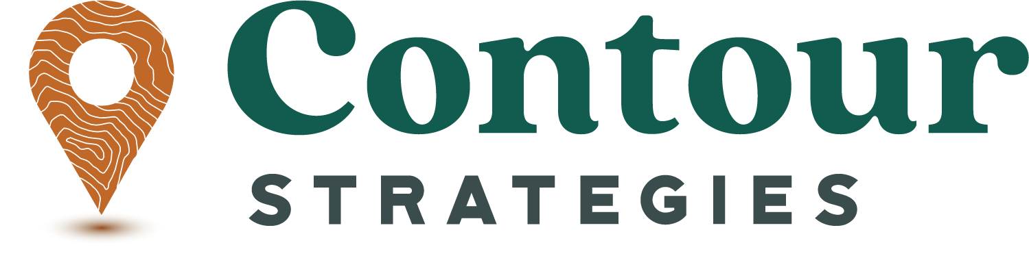
Contour’s new look.
In the landscape of fundraising, Contour Strategies is the “guide”. Every path, terrain, and journey may be a bit different, but Contour Strategies helps you navigate this ever-changing landscape and ultimately helps you reach your destination
The new logo strengthens this connection between the "contours of the land" and the modern ways we navigate it. The icon is a destination marker with typography lines within it that reflects this journey, the impressions made from it. The contour elevation lines used in the icon are from Mt. Hood, a mountain peak near the founder's home base of Portland, OR.

Website (re)fresh
As our team has grown and evolved, we wanted a place where we could better outline how we can serve our clients and allow prospective clients to get to know us a little better. We have chosen a color scheme of greens, browns, and bronze that elicits feelings of abundance, warmth, strength, and loyalty. The overall design of the site purposefully showcases movement, growth and simplicity.